
RUBY
[CCTV] 5.matplotlib기초 본문
서울시 CCTV 분석하기 프로젝트
5. matplotlib기초
matplotlib란?
파이썬의 대표 시각화 도구
Matplotlib는 Python 프로그래밍 언어 및 수학적 확장 NumPy 라이브러리를 활용한 플로팅 라이브러리이다. Tkinter , wxPython , Qt 또는 GTK 와 같은 범용 GUI 툴킷을 사용하여 애플리케이션에 플롯을 포함 하기 위한 객체 지향 API를 제공한다. Matplotlib은 매트랩과 유사하게 설계된 상태기계(예: OpenGL )을 기반으로 하는 절차적 "pylab" 인터페이스도 있지만 사용은 권장되지 않는다. SciPy는 Matplotlib을 활용한다.
plt로 많이 naming하여 사용한다.
Jupyter Notebook 유저의 경우 matplotlib의 결과가 out session에 나타나는 것이 유리하므로 %matplotlib inline 옵션을 사용한다.
1. matplotlib을 import한다.

import matplotlib.pyplot as plt
get_ipython().run_line_magic("matplotlib", "inline")


plt.rcParams['axes.unicode_minus'] = False
2.
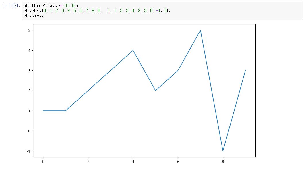
plt.figure(figsize=(10, 6))
plt.plot([0, 1, 2, 3, 4, 5, 6, 7, 8, 9], [1, 1, 2, 3, 4, 2, 3, 5, -1, 3])
plt.show()
3. numpy의 sin함수를 가져오자
* np.arange(a, b, s) : a부터 b까지의 s의 간격
* np.sin(value)

import numpy as np

t = np.arange(0, 12, 0.01)
y = np.sin(t)
그래프를 그리는 코드는 def()로 작성한다.
- 그러면 나중에 별도의 셀에서 그림만 나타낼 수 있기 때문이다.
4.
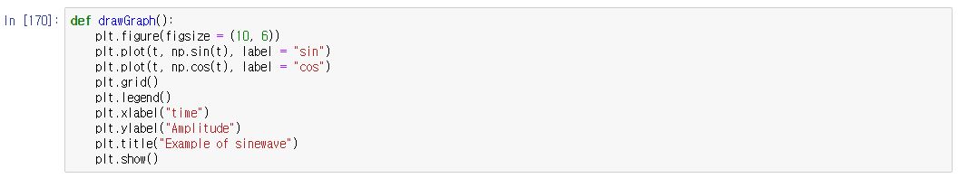
def drawGraph():
    plt.figure(figsize = (10, 6))
    plt.plot(t, np.sin(t), label = "sin")
    plt.plot(t, np.cos(t), label = "cos")
    plt.grid()
    plt.legend()
    plt.xlabel("time")
    plt.ylabel("Amplitude")
    plt.title("Example of sinewave")
    plt.show()
5.
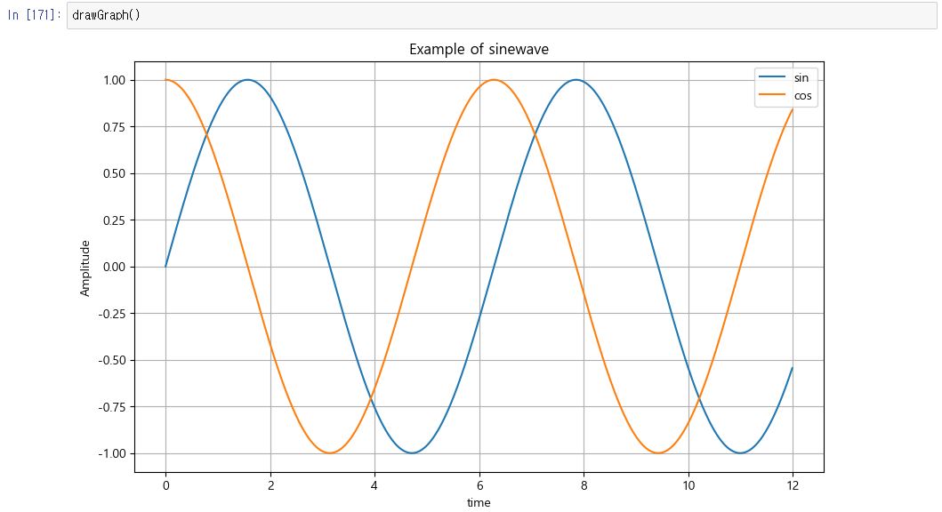
drawGraph()
6.
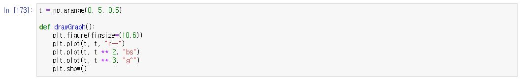
t = np.arange(0, 5, 0.5)

def drawGraph():
    plt.figure(figsize=(10,6))
    plt.plot(t, t, "r--")
    plt.plot(t, t ** 2, "bs")
    plt.plot(t, t ** 3, "g^")
    plt.show()
7.
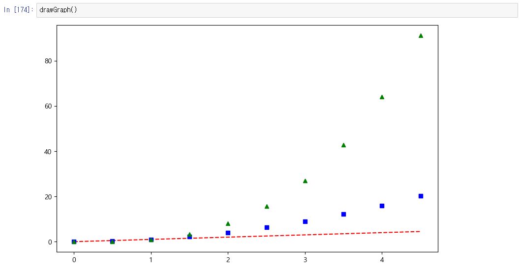
drawGraph()
8. 다양한 스타일을 지정할 수 있다.
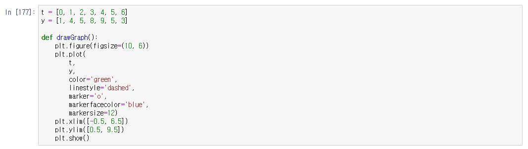
t = [0, 1, 2, 3, 4, 5, 6]
y = [1, 4, 5, 8, 9, 5, 3]

def drawGraph():
    plt.figure(figsize=(10, 6))
    plt.plot(
        t,
        y,
        color='green',
        linestyle='dashed',
        marker='o',
        markerfacecolor='blue',
        markersize=12)
    plt.xlim([-0.5, 6.5])
    plt.ylim([0.5, 9.5])
    plt.show()
9.
drawGraph()
10. scatter는 점을 뿌리듯이 그리는 그림이다.
t = np.array([0, 1, 2, 3, 4, 5, 6, 7, 8, 9])
y = np.array([9, 8, 7, 9, 8, 3, 2, 4, 3, 4])

def drawGraph():
    plt.figure(figsize=(10, 6))
    plt.scatter(t, y)
    plt.show()
11.
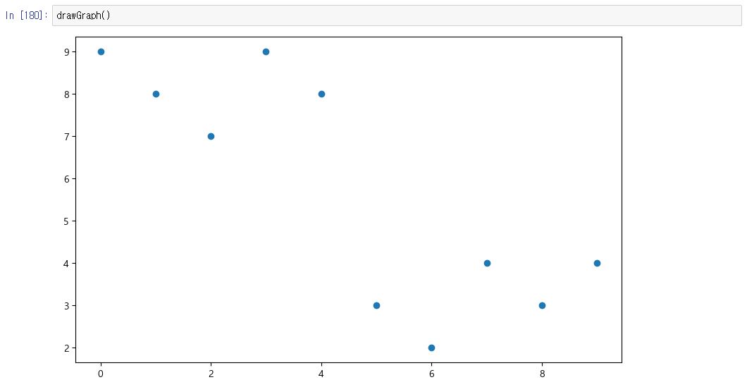
drawGraph()
12.colormap을 적용할 수 있다.
colormap = t
def drawGraph():
    plt.figure(figsize=(10, 6))
    plt.scatter(t, y, s=50, c=colormap, marker=">")
    plt.colorbar()
    plt.show()
13.
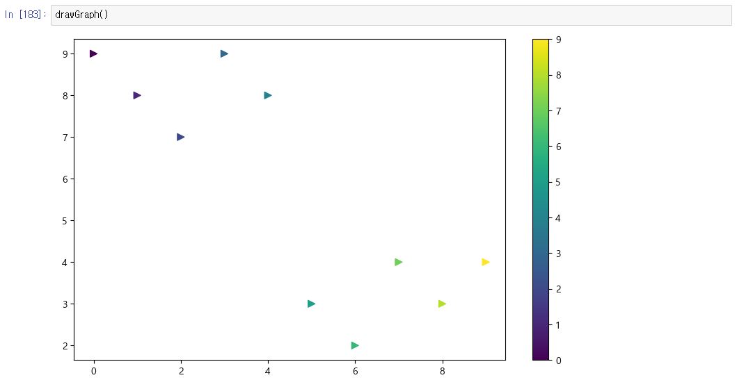
drawGraph()
14.

from matplotlib import rc
plt.rcParams["axes.unicode_minus"] = False
rc("font", family='Malgun Gothic')
15.
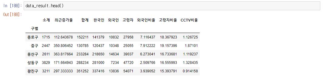
data_result.head()
16. Pandas DataFrame은 데이터 변수에서 바로 plot()명령을 사용할 수 있다.
* 그리고 데이터(컬럼)가 많은 경우 정렬한 후 그리는 것이 효과적일 때가 많다.
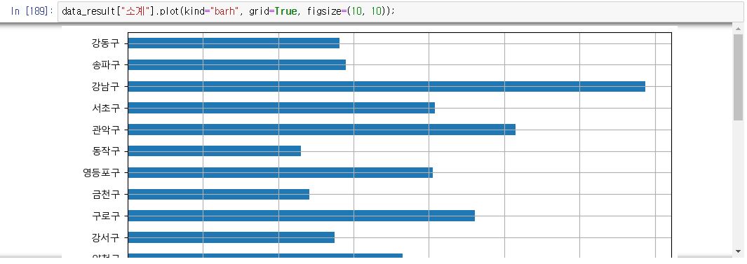
data_result["소계"].plot(kind="barh", grid=True, figsize=(10, 10));
17.
def drawGraph():
    data_result["소계"].sort_values().plot(
        kind="barh",
        grid=True,
        title="가장 CCTV가 많은 구",
        figsize=(10, 10)
    )
18.
drawGraph()
19.
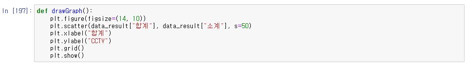
def drawGraph():
    plt.figure(figsize=(14, 10))
    plt.scatter(data_result["합계"], data_result["소계"], s=50)
    plt.xlabel("합계")
    plt.ylabel("CCTV")
    plt.grid()
    plt.show()
22.
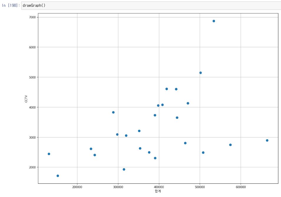
drawGraph()
'데이터 분석 > EDA_웹크롤링_파이썬프로그래밍' 카테고리의 다른 글
| [CRIME] 2. 데이터 얻기 (0) | 2023.02.03 |
|---|---|
| [CRIME] 1. 목표 (0) | 2023.02.02 |
| [CCTV] 4.Pandas 데이터 merge를 이용해서 병합하기 (0) | 2023.02.01 |
| [CCTV] 3.Pandas로 데이터 읽기(4) (0) | 2023.02.01 |
| [CCTV] 3.Pandas로 데이터 읽기(3) (0) | 2023.02.01 |


